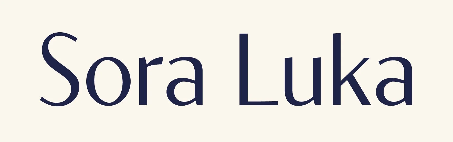
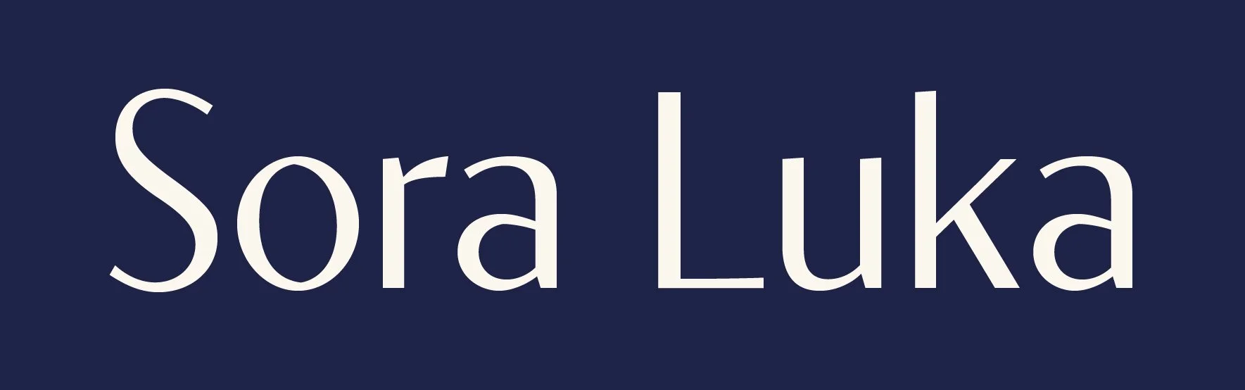
Sora Luka
Premium Skincare
Sora Luka is a high-end skincare brand that combines science-based formulas with simple luxury. Inspired by the calmness of the sky and the clean essence of nature, the brand conveys clarity, softness, and brightness in both its design and user experience. The name Sora Luka means “Sky Light.” It represents purity, peace, and light, which are evident in every detail.
Tools


Roles
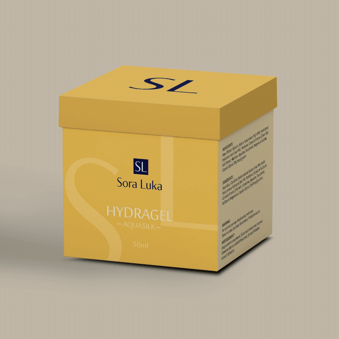
Packaging Designer
Web & Digital
Brand Identity Designer
Skills
UI/UX Design
Visual Storytelling
Social Media Design & Strategy
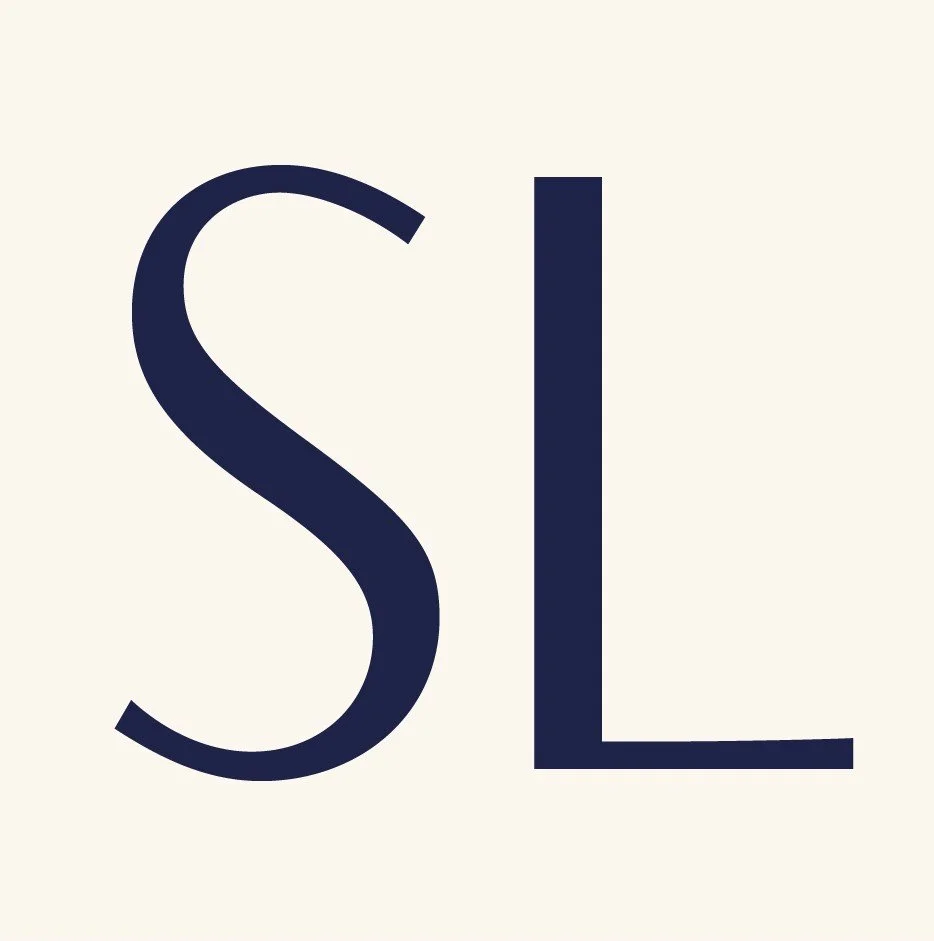
Main Logo
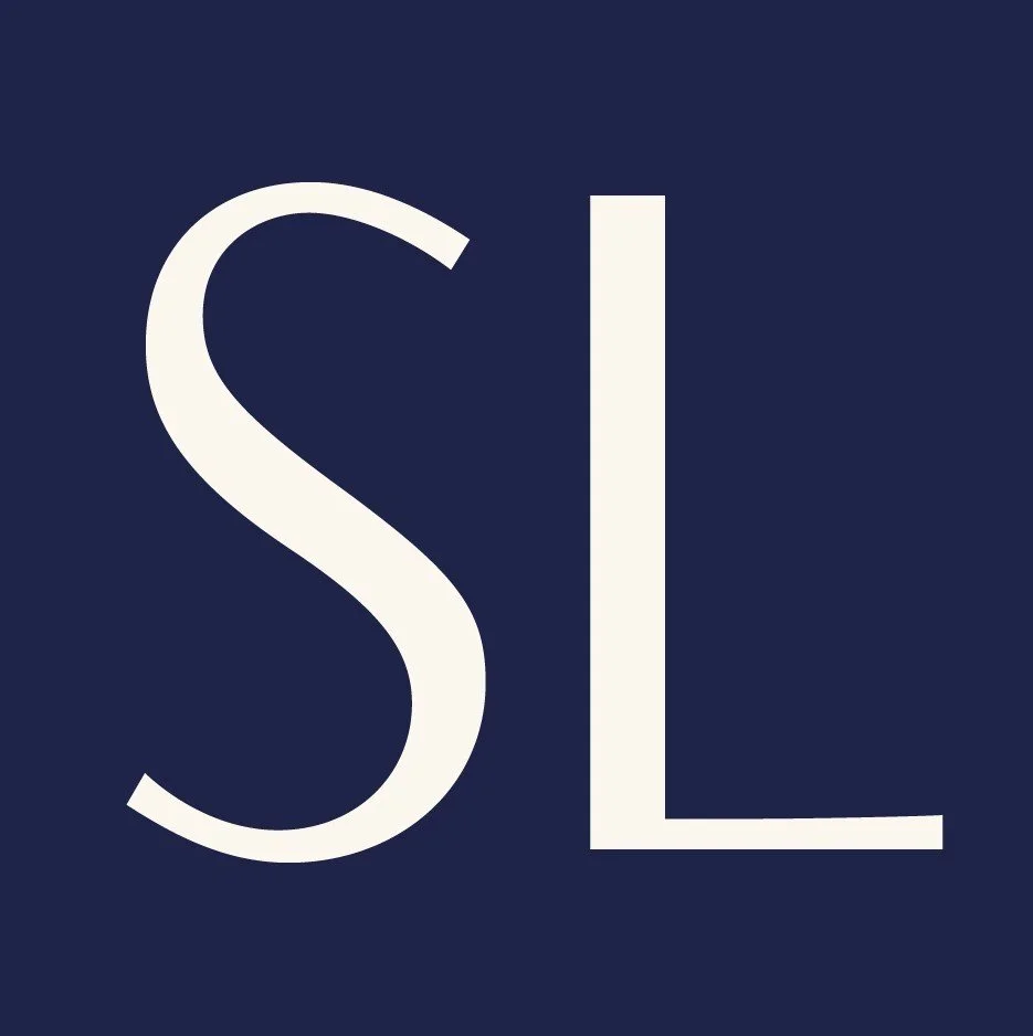
Reversed Logo

#0E103F
#7F8AA0
#FBF7EF
#DBB75C
#F3E8D3
#F9E6B7
The Sora Luka palette combines deep navy for sophistication, soft neutrals for purity, and gold tones for luxury. Together, these colors show clarity, elegance, and simplicity.
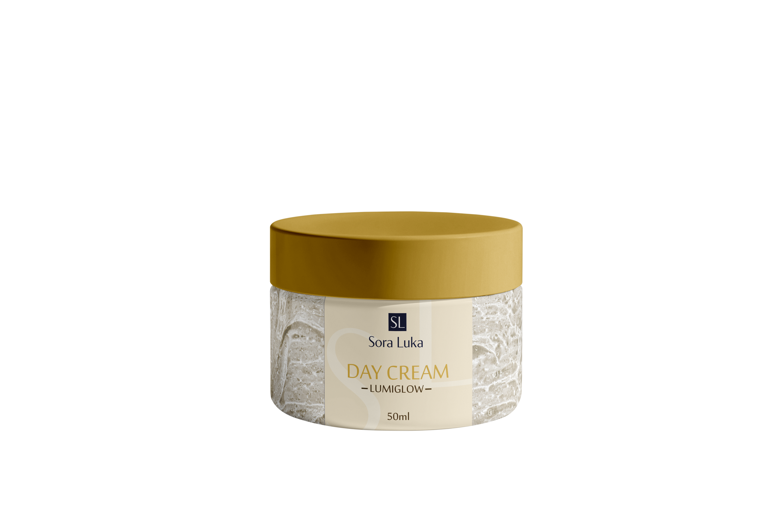
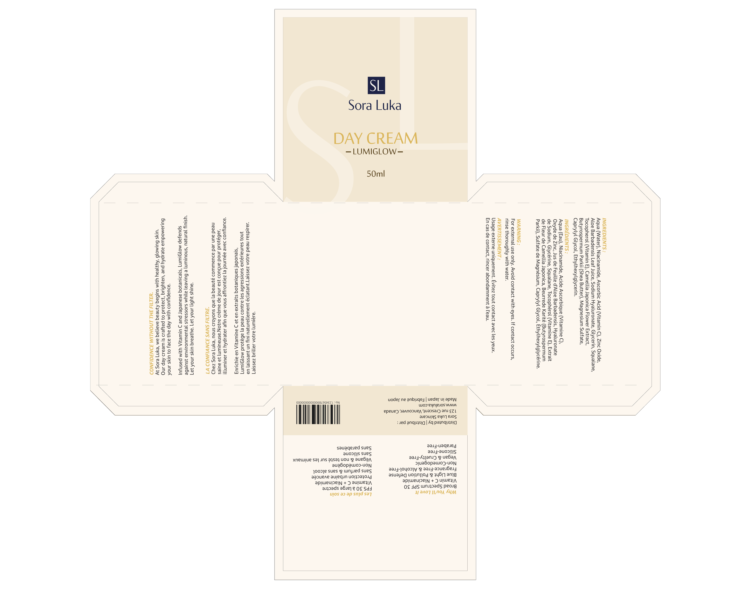
Day Cream – Lumiglow
A lightweight, revitalizing cream designed to brighten and protect your skin throughout the day. Infused with antioxidants and hydrating actives, it restores natural radiance while keeping skin smooth and luminous.
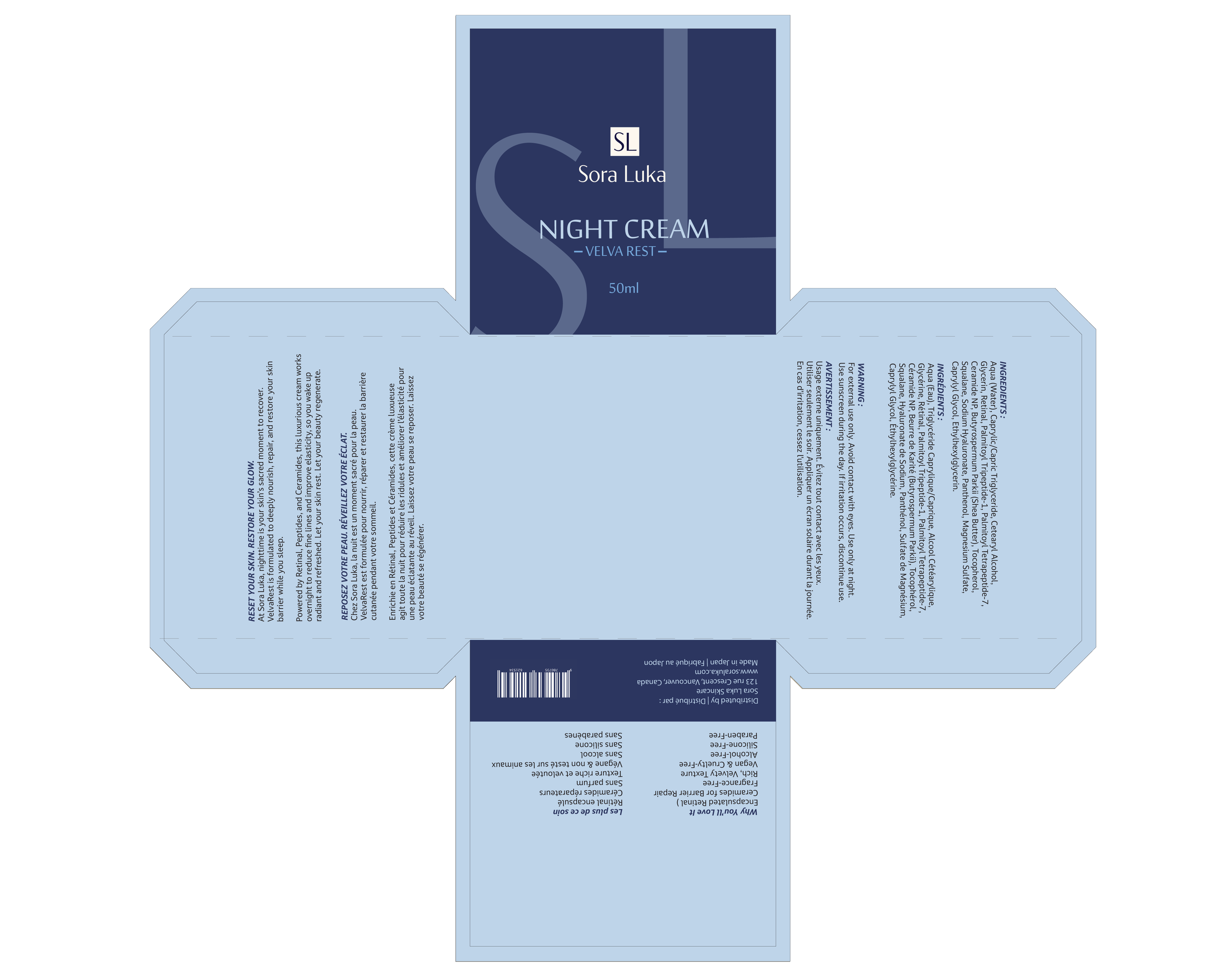
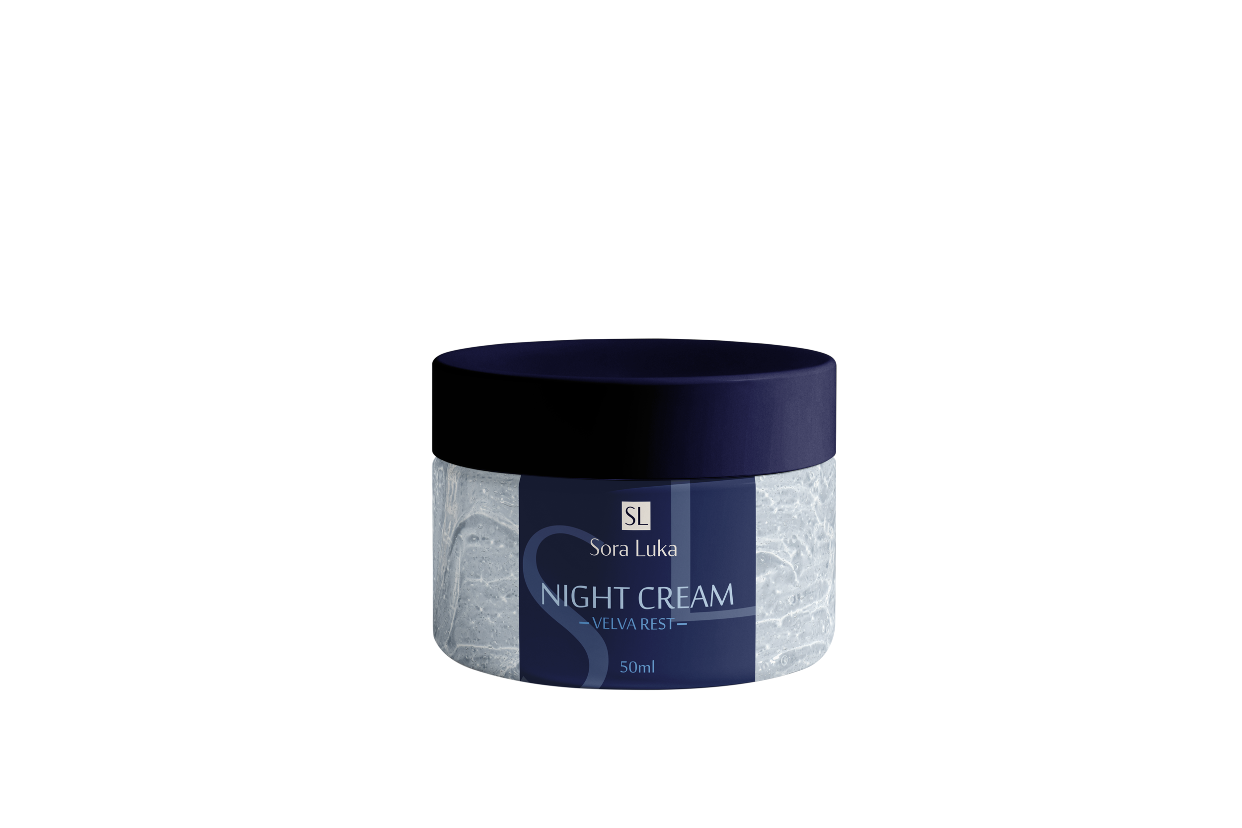
Night Cream – Velva Rest
A deeply nourishing night treatment that works while you sleep. Enriched with restorative botanicals and peptides, it supports skin renewal, improves elasticity, and leaves your complexion feeling velvety and refreshed by morning.
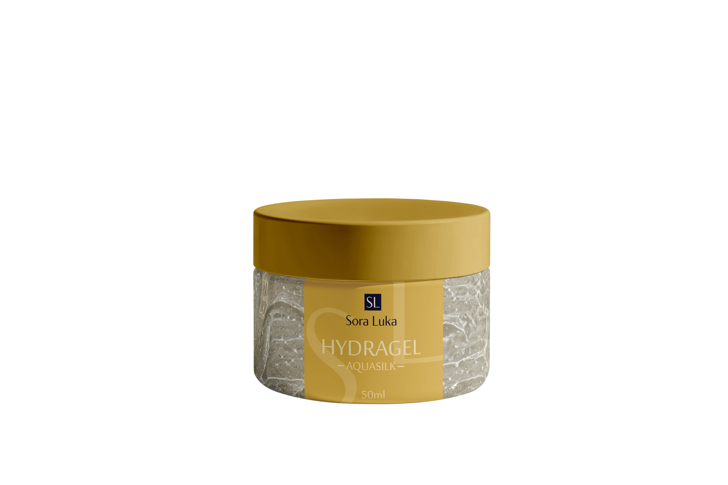
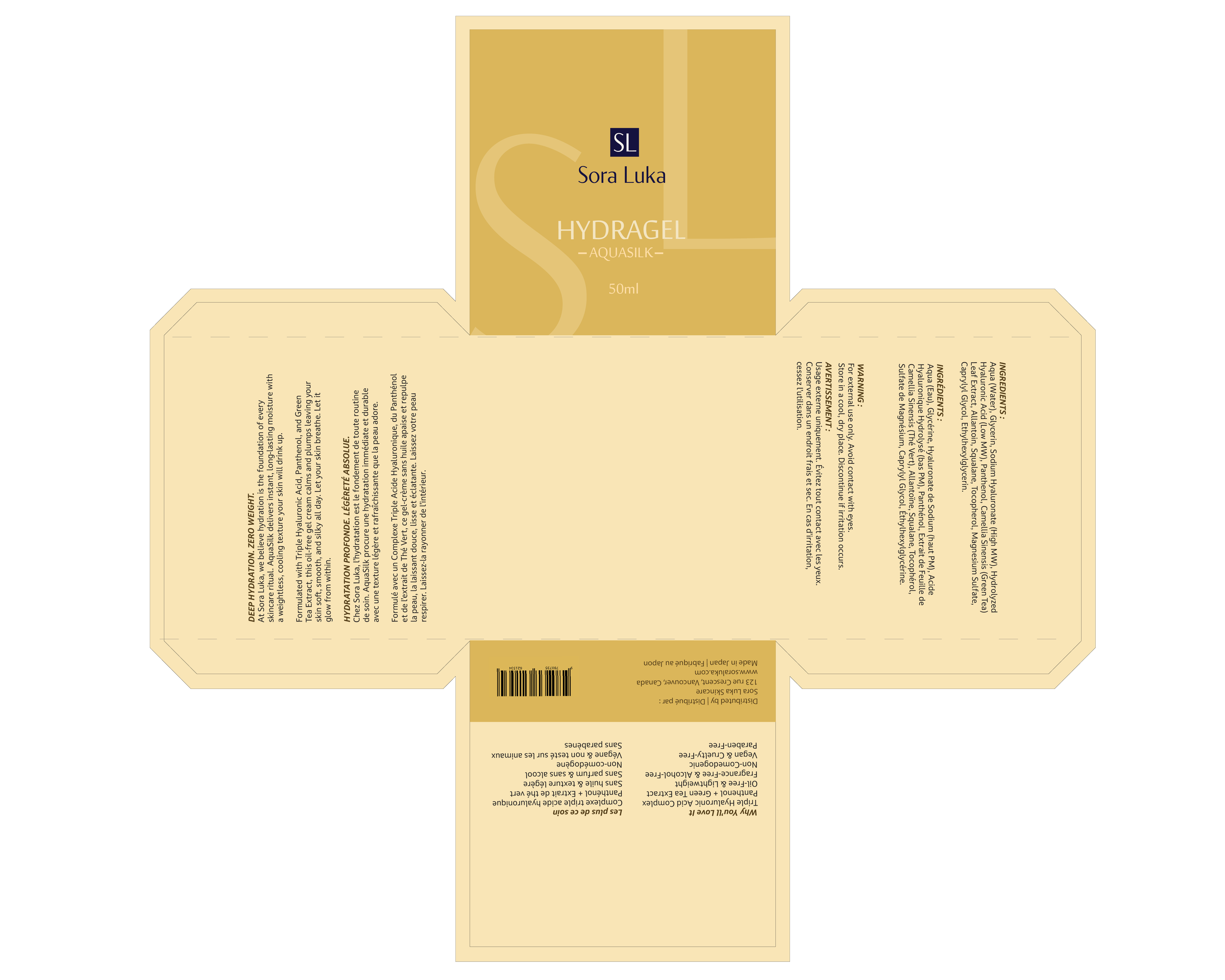
Hydragel – Aquasilk
A refreshing gel formula that delivers intense hydration with a weightless feel. Packed with moisture-binding ingredients, it soothes, plumps, and leaves skin silky soft, making it ideal for daily use.
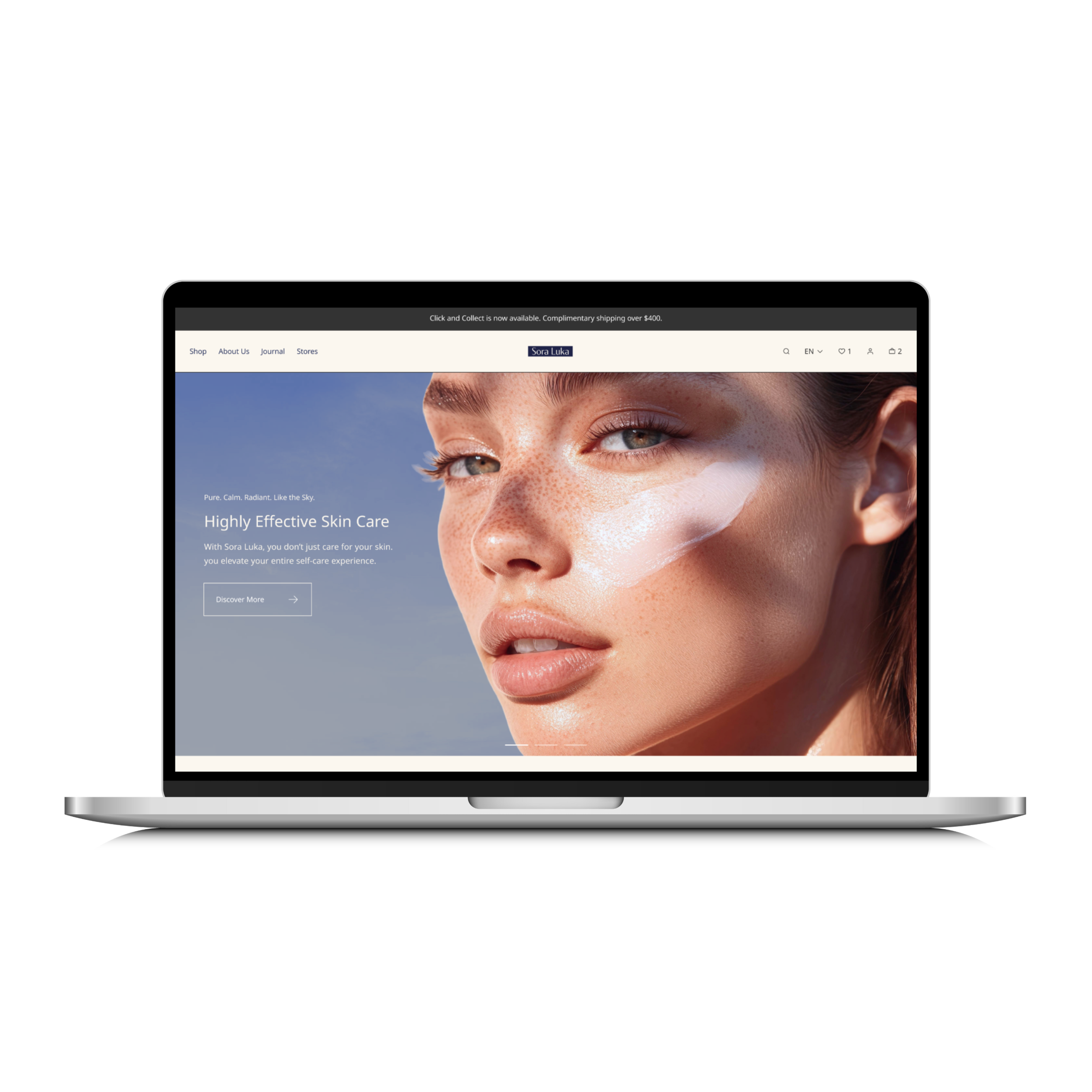
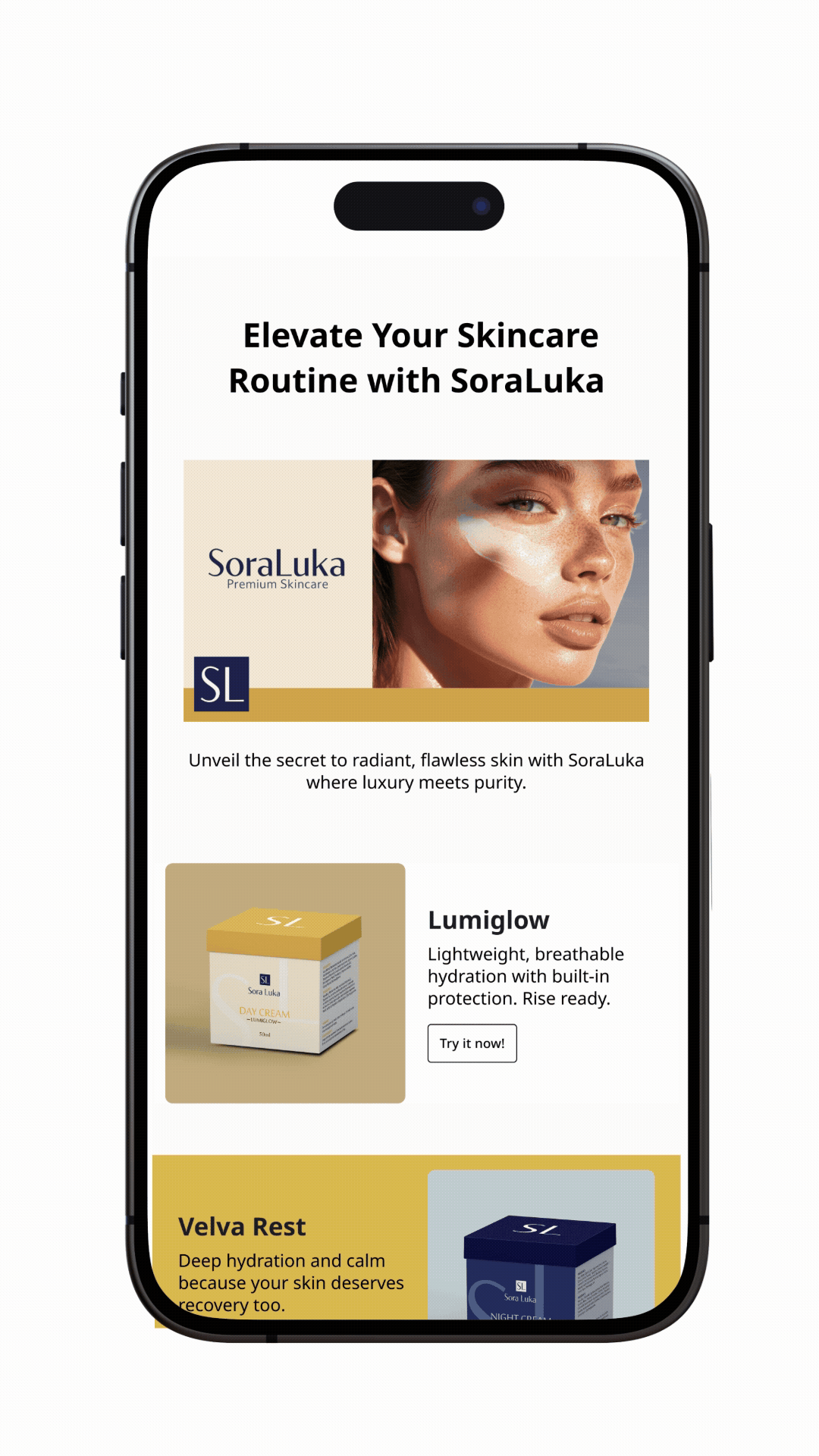
Website & Email Template Design
To build a cohesive identity for Sora Luka, I designed a clean, calming website that reflects the brand’s purity, serenity, and luxury. I also created minimal, responsive email templates that align with the brand and can be used for newsletters, promotions, and customer engagement.